Introduction to Media Queries
The following files are required for this lesson:
Introduction
This lesson will be taught in two parts:
Demo Instructions
You can follow along with your instructor to complete this build and/or you can use this document as a guide in completing the demo build.
Steps - Part 1: Media Queries
- Download the demo-media-queries.zip file and extract its contents to a folder named demo-media-queries.
- A wide resolution of the index.html should look like:
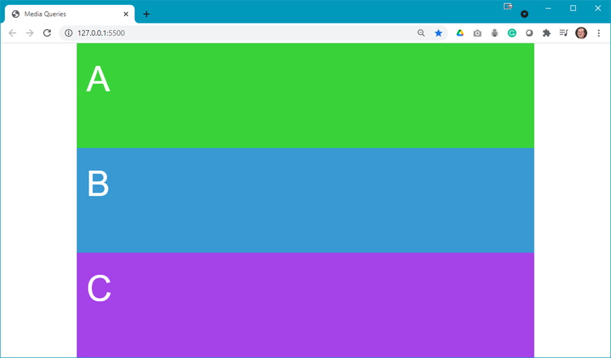
- When you narrow your browser, you want to see something like:

Note: the color changes. - Open the styles.css file and scroll down to find the comment about Media Queries and add the following:

Question: What did this media query do? - Add the following query below the one you just added:

Question: What did this media query do? - Now add the last media query:
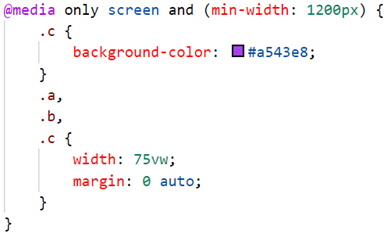
Question: What did this media query do? - For each of the media queries, use the developer tools to set the width that will trigger the change.
Steps - Part 2: RWD Menu
- Download the demo-rwd-menu.zip file and extract its contents to a folder named demo-rwd-menu.
- A wide resolution of the index.html should look like:
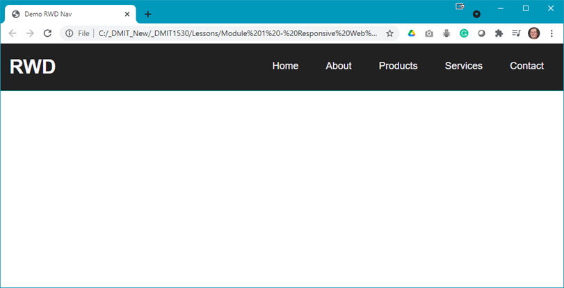
- When you narrow your browser, you want to see something like:
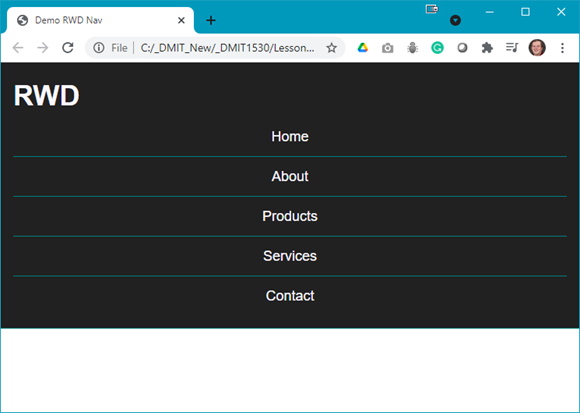
- Examine the index.html file to see the menu:
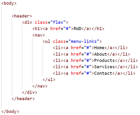
Note: There is nothing special here; we can see the<nav>element is inside aflexcontainer. - Open the styles.css file and scroll down to find the start of the first media query and code as shown below:
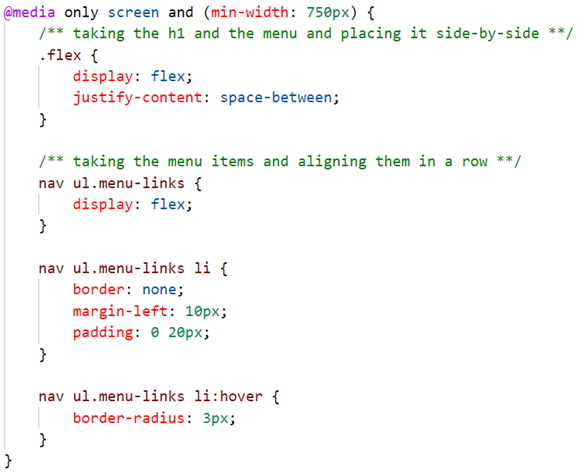
Here you see the style rules that get applied when the width is>= 750px. - Open the developer tools in your browser and make the following change:

- Now, change the width to 749 px and you should get:
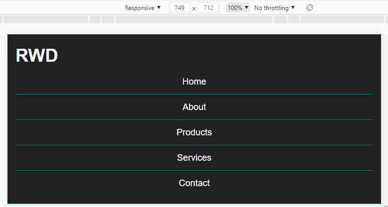
Notice that the layout changed as the width now is less than the width set in the media query. - Now add the code below to the second media query in your styles.css:
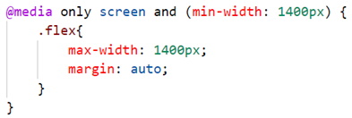
- In developer tools make the following change:

- Now change the size and see what happens, i.e.:

And:

Notice that no matter how wide we make the browser window, the menu is locked at a width of 1400 px.
Summary
More media query examples will be demonstrated in the next demo.